

The Rental Roof Blog
Only the good stuff. Never fluff.
Monthly Portfolio Performance


Recent Commentary:
Very tough start to 2025, with five turns in the first five months driving down cash flow. Starting in June, things stabilized and I’ve been able to make up some lost ground — in fact, September and October were my two highest cash flow months ever,
Of course, it couldn’t last forever: two more unanticipated turns in November will bring more red ink to my report before the year is out.
That makes seven turns in 2025, which is the most I’ve ever had. Not ideal! Will still likely cash flow $100K+ despite all that.
Revenue & Expenses Detail (2025)
Total Cash Flow vs. Expectations

*most recent month’s data is preliminary
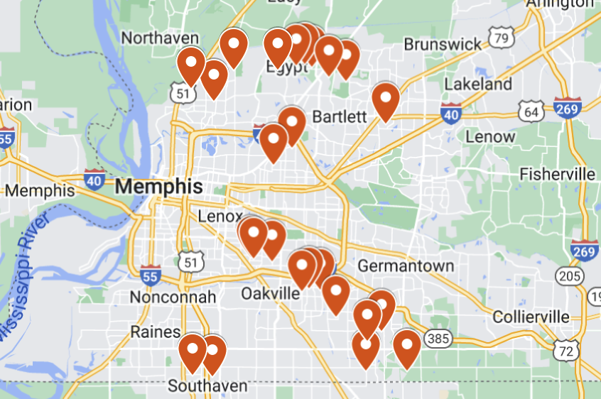
Cash Flow by Property Detail

Occupancy Detail

Annual Portfolio Reports

The full report on my portfolio’s performance in 2023 — the good, the bad, and the ugly! Includes all the numbers and lessons learned.

The full report on my portfolio’s performance in 2022, including all the numbers and lessons learned.

A look back at my portfolio in 2021, including all the numbers and lessons learned.

You can learn a lot by looking back at your rental properties’ performance at the end of the year. Here’s how to do it — along with my full results from 2020.
Monthly Portfolio Reports
NOTE: I stopped publishing Monthly Portfolio Reports in February 2025. All the updated monthly financial statistics for my portfolio can be found at the top of this page.


My full annual portfolio report for 2024. This was one of the most challenging & expensive years I’ve had with my Memphis rental portfolio — find out why, and what adjustments I’m making going forward.